No products in the cart.
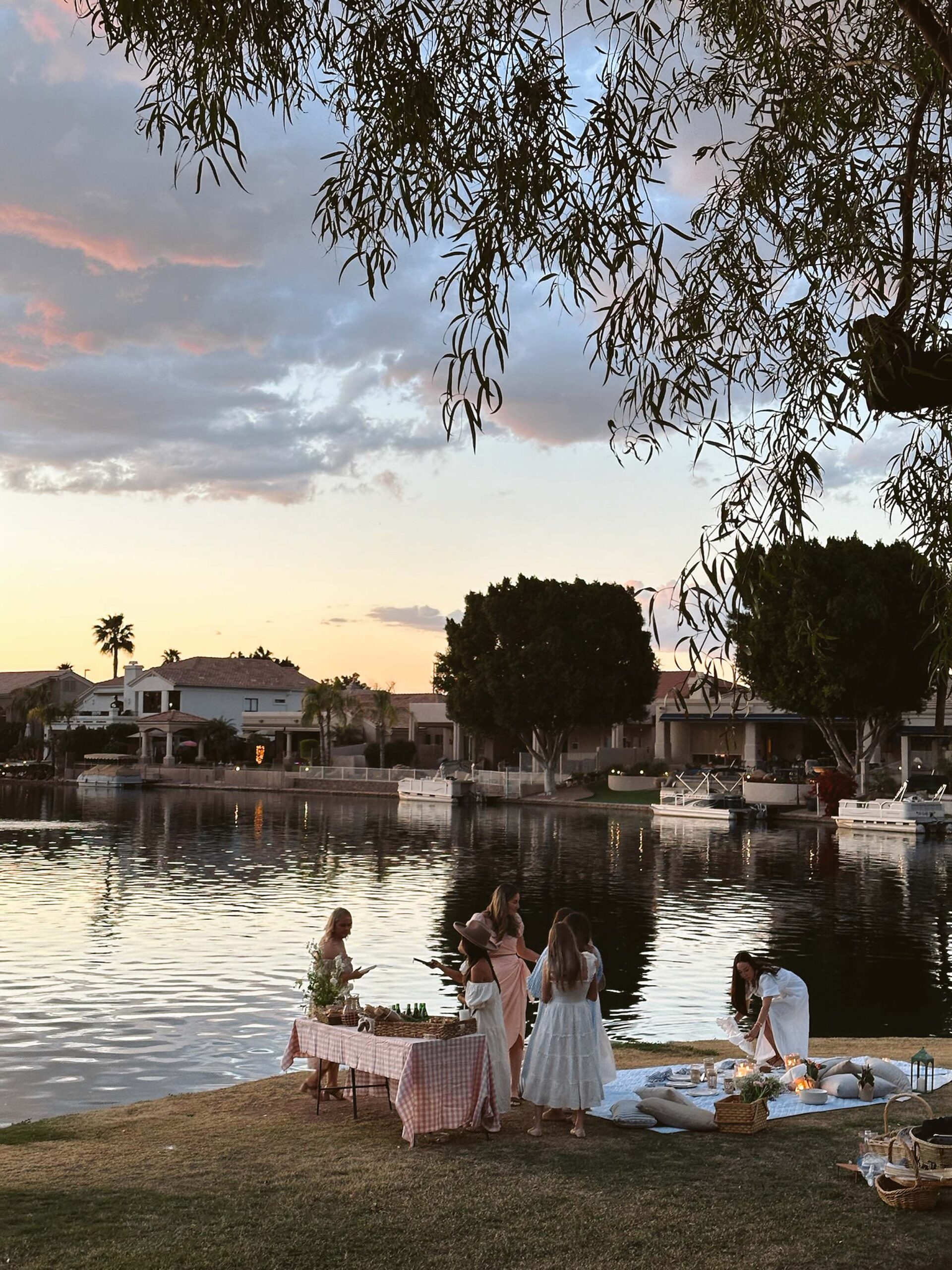
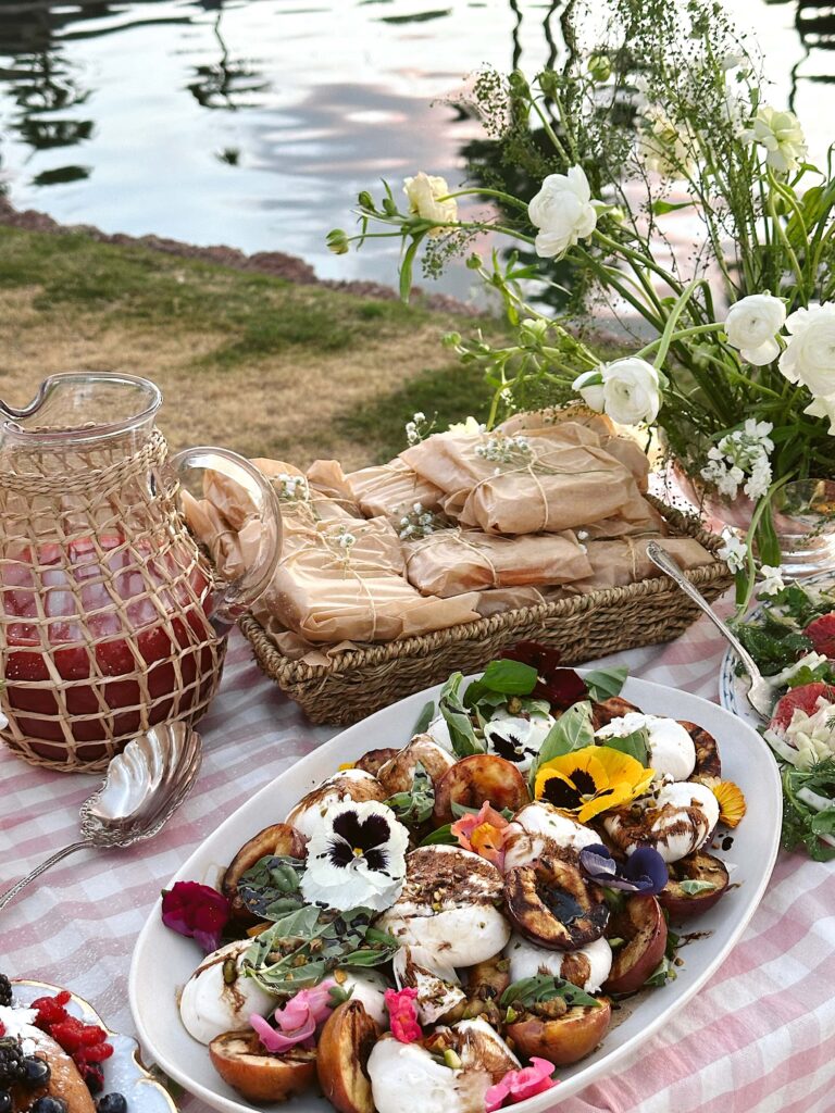
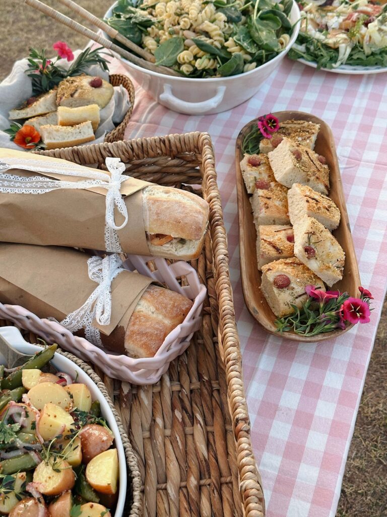
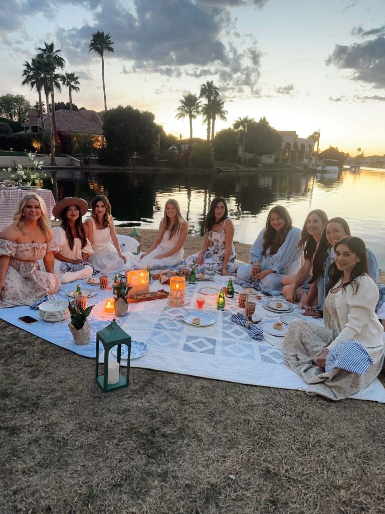
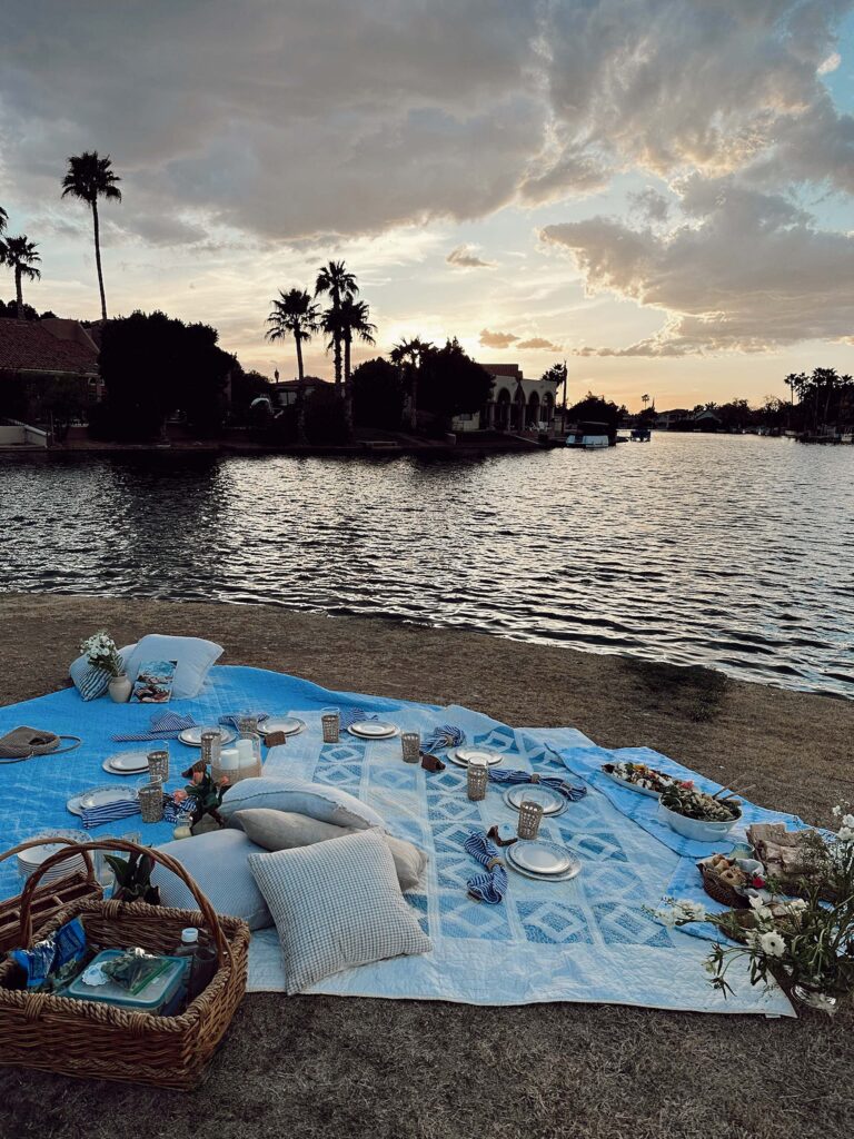
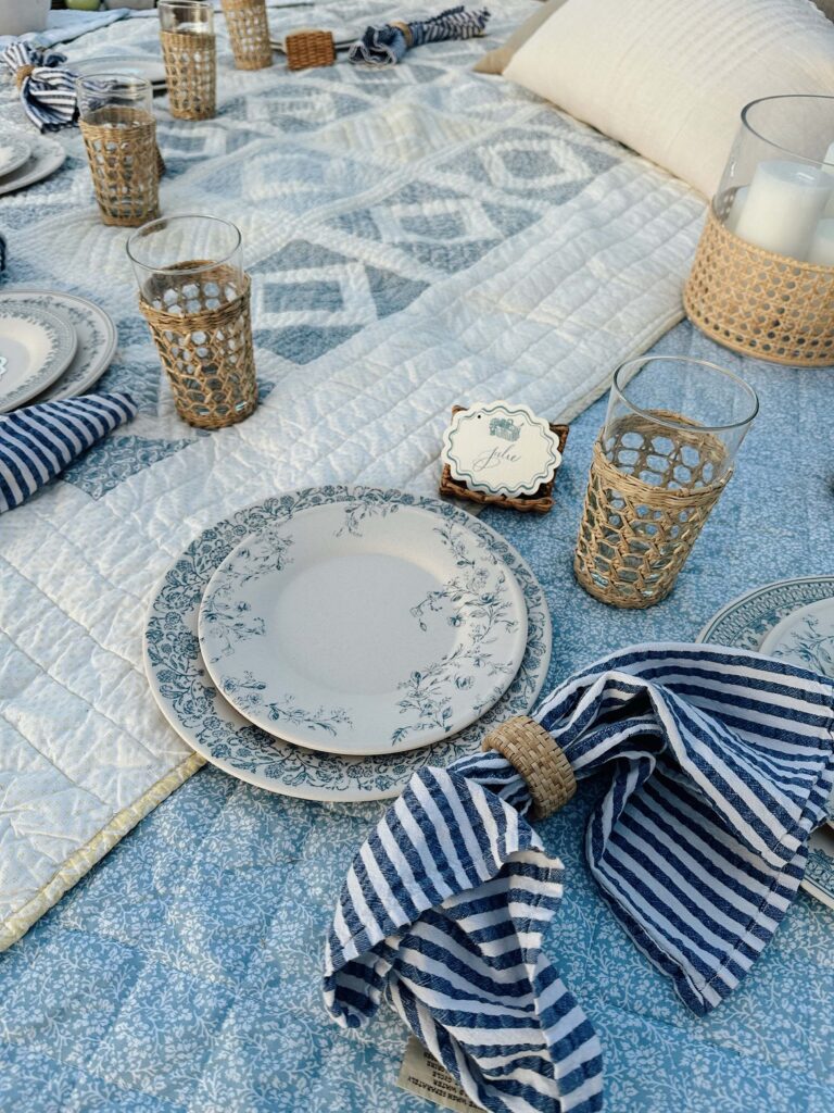
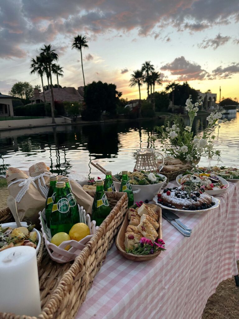
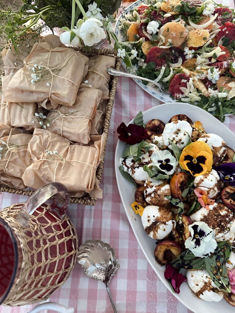
Picnic by the lake
Diana Elizabeth is an author, photographer, and obsessive thrift shopper. You can typically find her in the garden wrist deep in dirt, at a local estate sale or planning her next creative themed party. She continues to blog weekly.
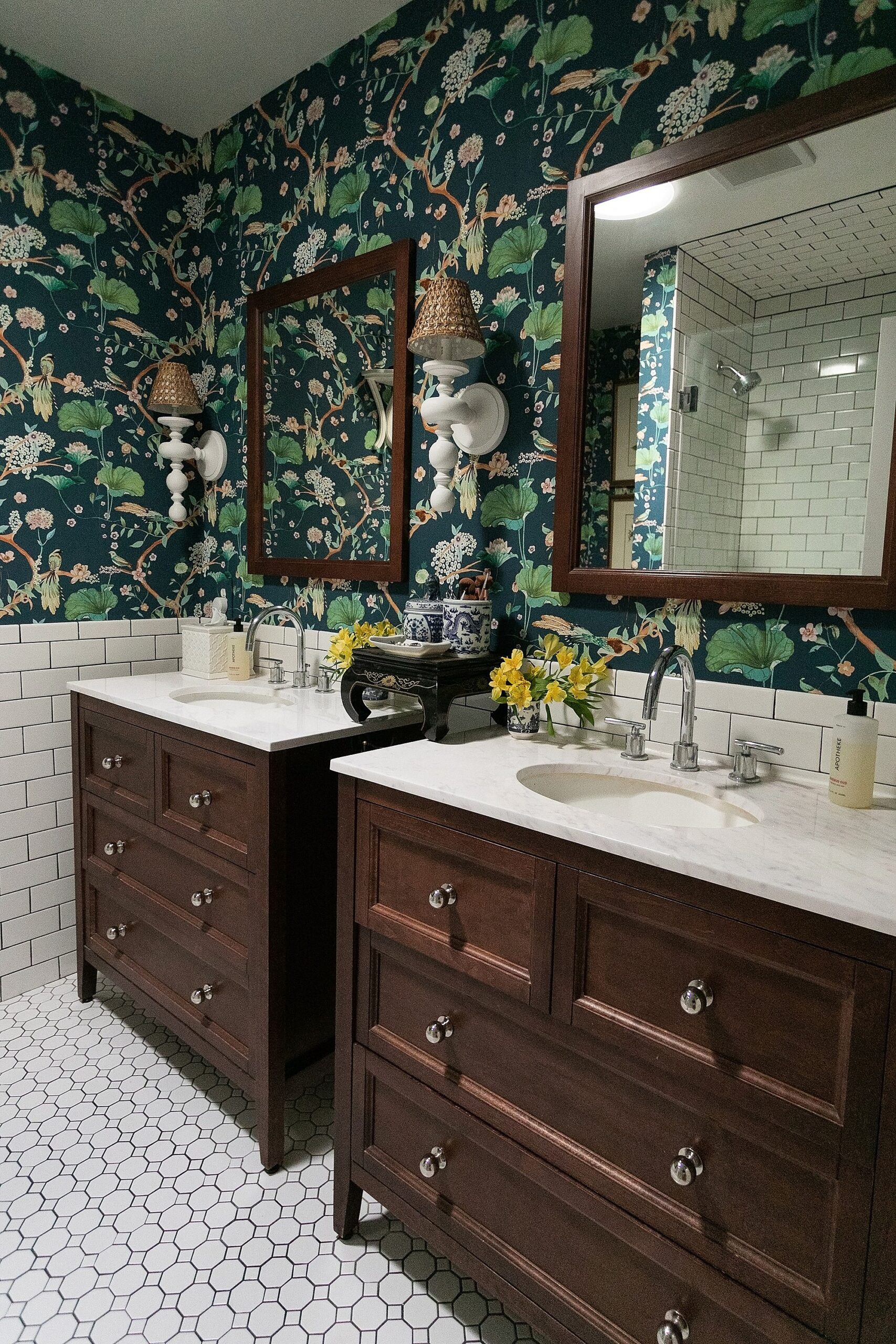
After 12 years of a plain white box of a bathroom, my bathroom which i
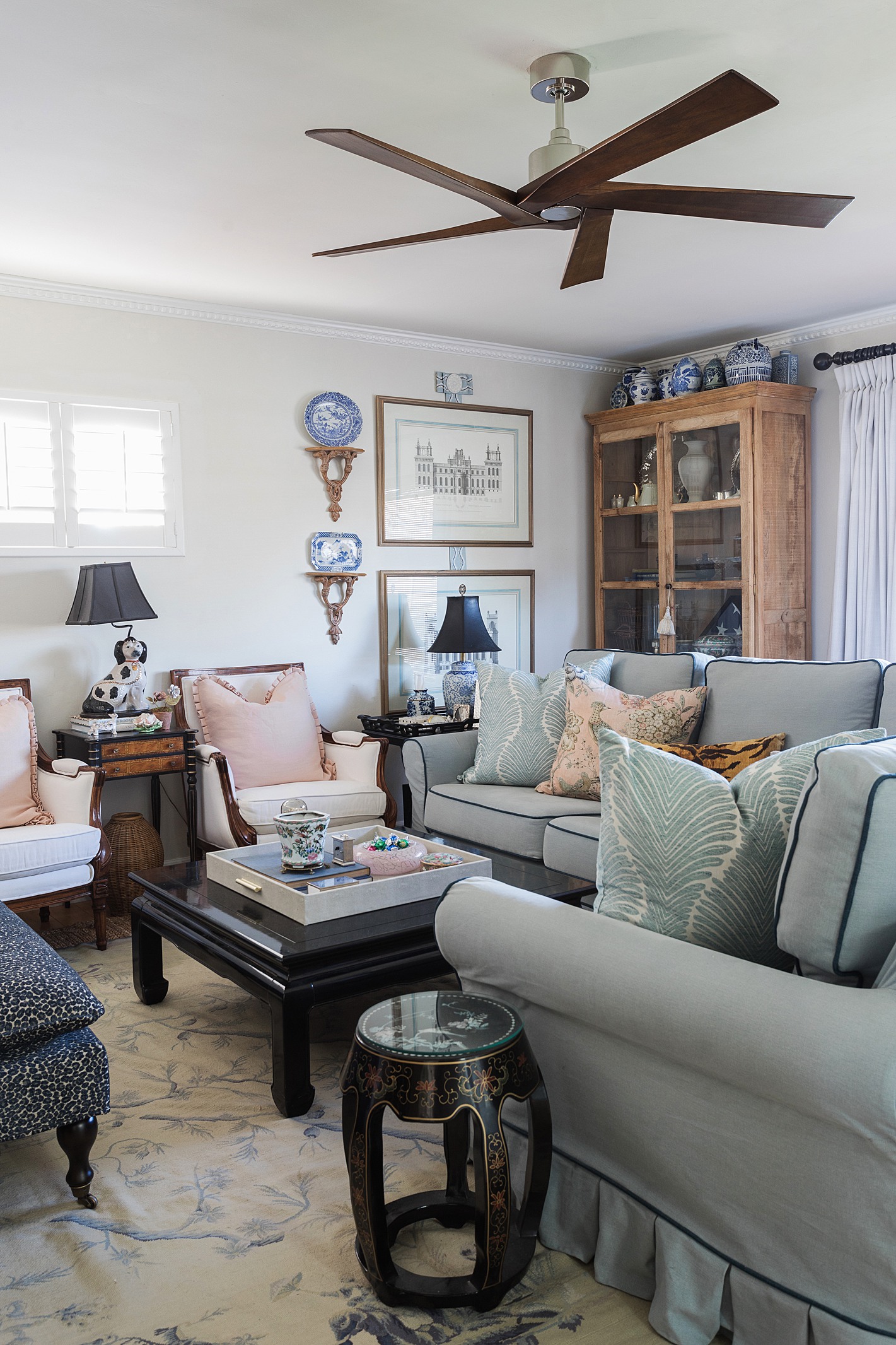
New crown molding in the living room -- and dining room -- but I also
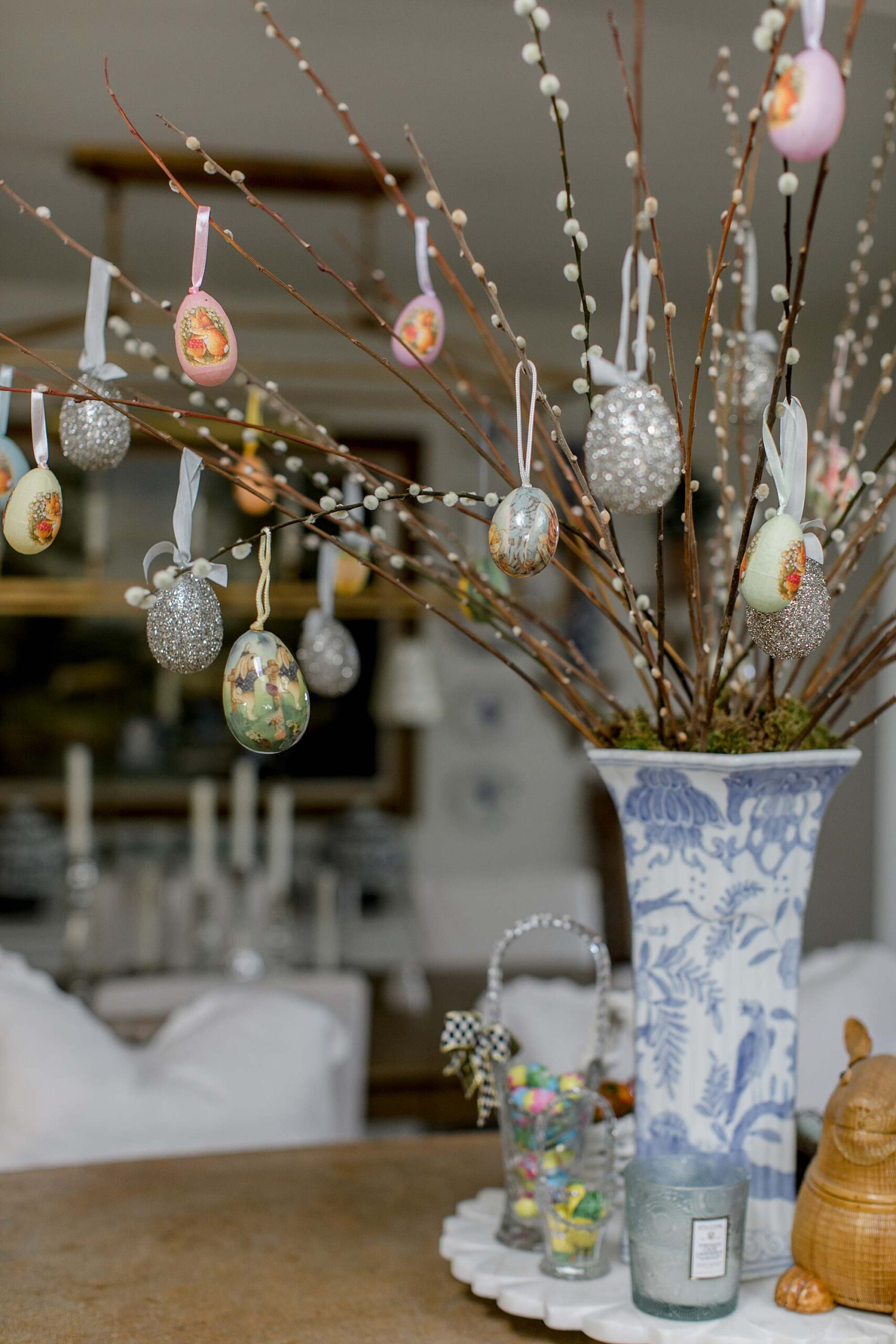
Let’s make an Easter egg tree from pussy Willow branches! I include
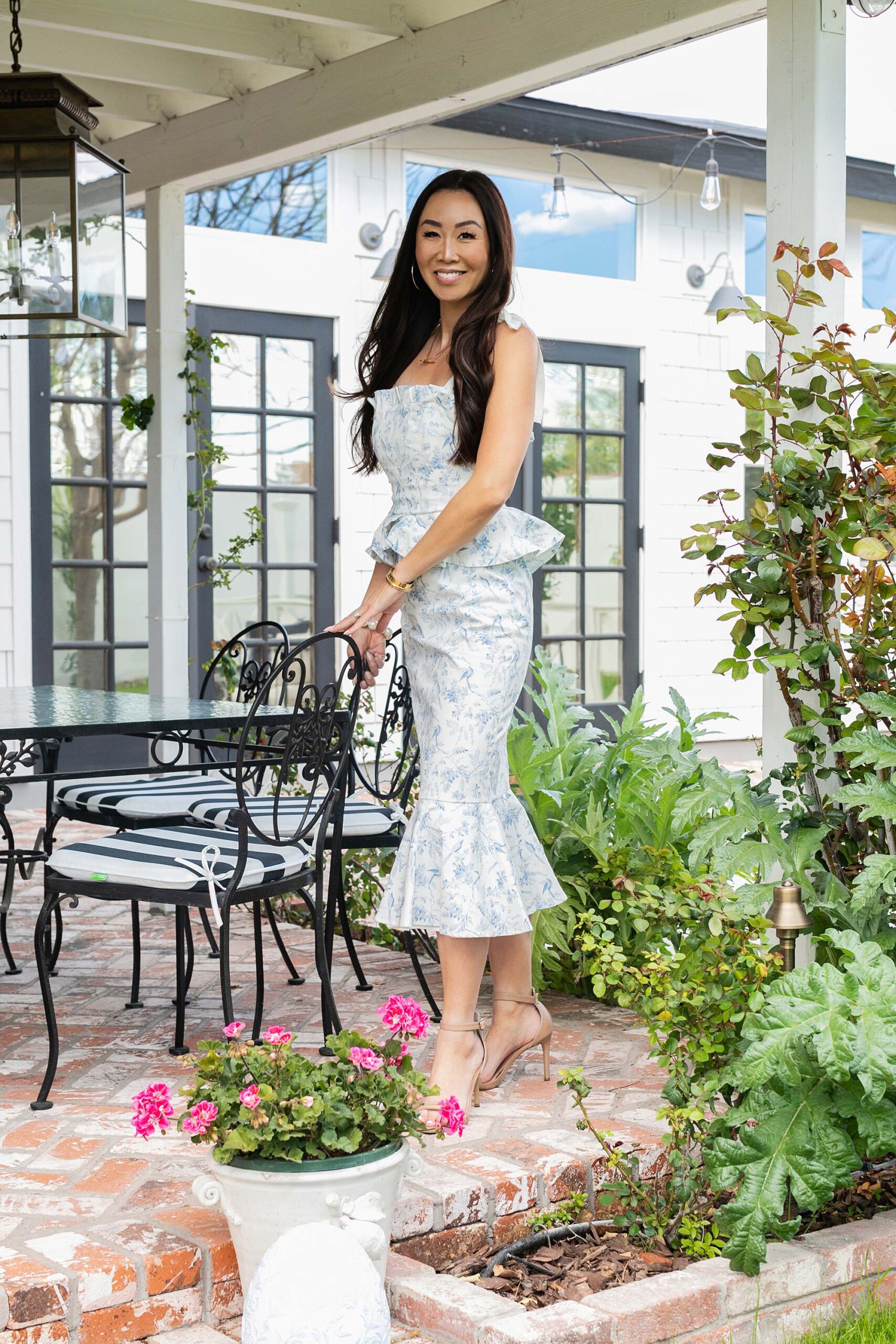
Easter invitations have been sent and now I'm sharing some Easter outf

We started on the master closet expansion despite some concerning dela
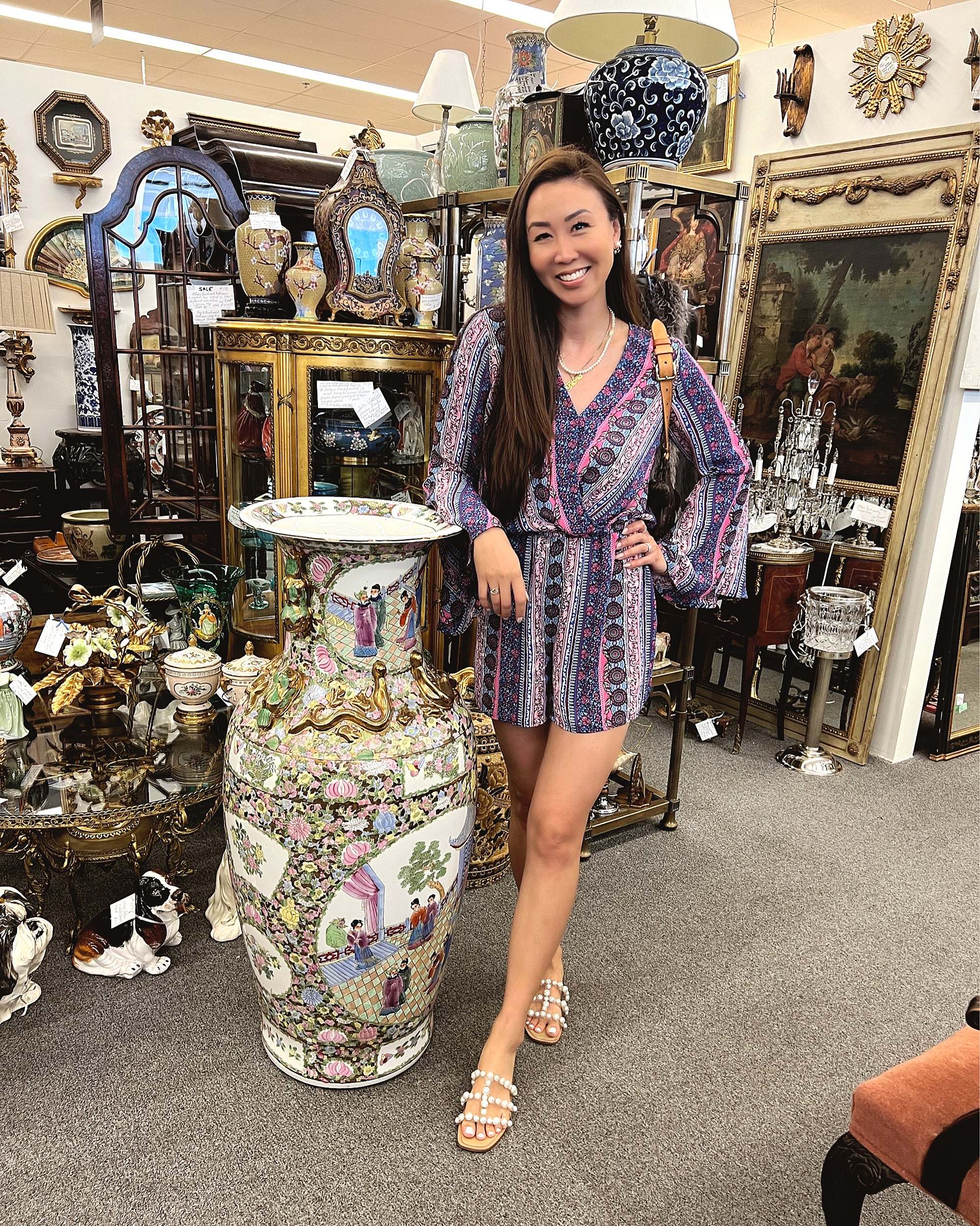
Look what I found at one of my favorite stores, Antique Gatherings - a


POST COMMENT