No products in the cart.

7 Interior Design Books I’m Loving
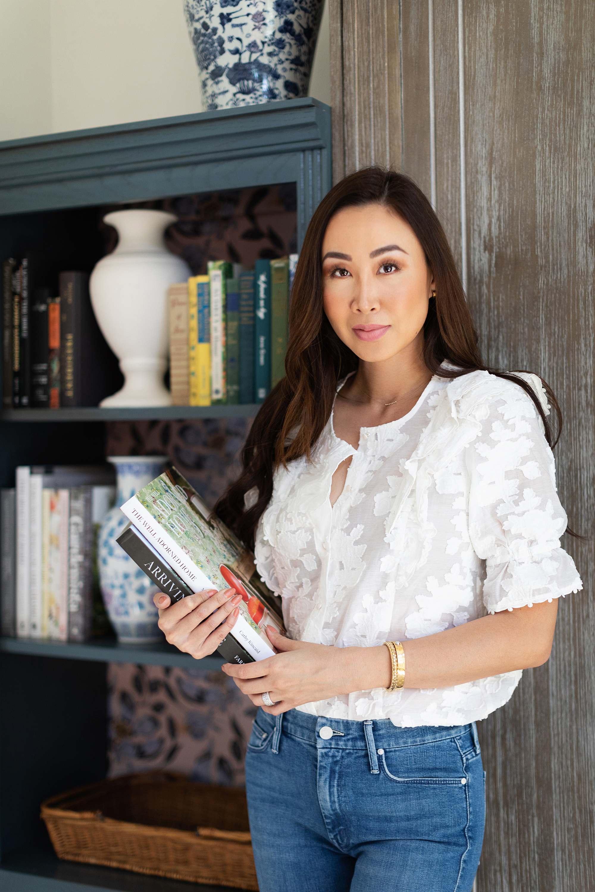
Blouse: Sezane (wearing size 4) / Denim: Mother
I
f you ever feel stuck with your style or want to know what exactly is your style, I recommend looking at interior design books. If you can find a few interior design books that fit your stye – and I mean PUSH your style too, it will be so beneficial when you decorate. Now when I say push, this what I mean – a little extra, a little more out there, a little more stuff than you might put in yours. Because you can take ideas and scale it back.
You don’t want an interior design book that looks empty, scarce and not enough because that means there aren’t enough ideas! For instance, minimalism isn’t going to work for me, because I know that’s not my style so I will need more things to look at, I am a more is more girl! However, those minimalist design books do offer more than simple decor, it’s about finishes, scale, architectural placement of windows, doors, they will focus on other design aspects opposed to objects – so they are still helpful depending what you are looking to get out of a book.
I’m a blend of a variety of styles – I can’t put my finger on – this is 100% me, all I know is how I want my home to feel, cozy. I am a modern traditionalist with a love for old. My ideal home is probably in Cotswold, but truthfully I love and adore and appreciate all good designed homes – I would take either home in The Holiday, any day (actually Jude Law’s home might be my favorite)!
Knowing that I’m a blend of a several styles, I wanted to share my favorite interior design books I reference to make sure what I’m bringing in my home still fits the feel, or look I’m going for. Interior design books to me are a resource of inspiration but also a reference when I need inspiration and can confirm the lamp style I’m looking at, will work.
If you can pinpoint exactly what makes you feel like “home” and find the right books, buy as many as of those types as you can for inspiration – design books are better than Pinterest because they will be your interior design compass.
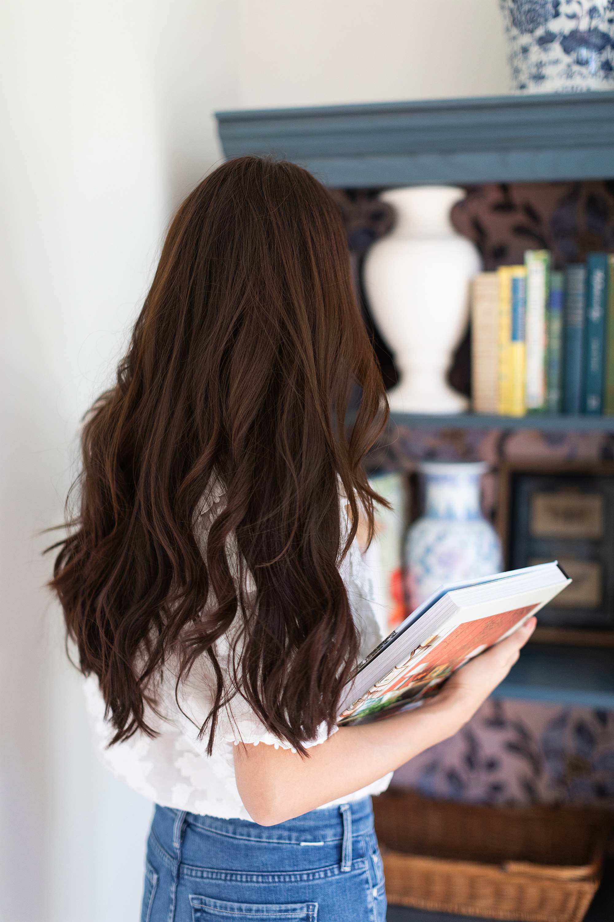
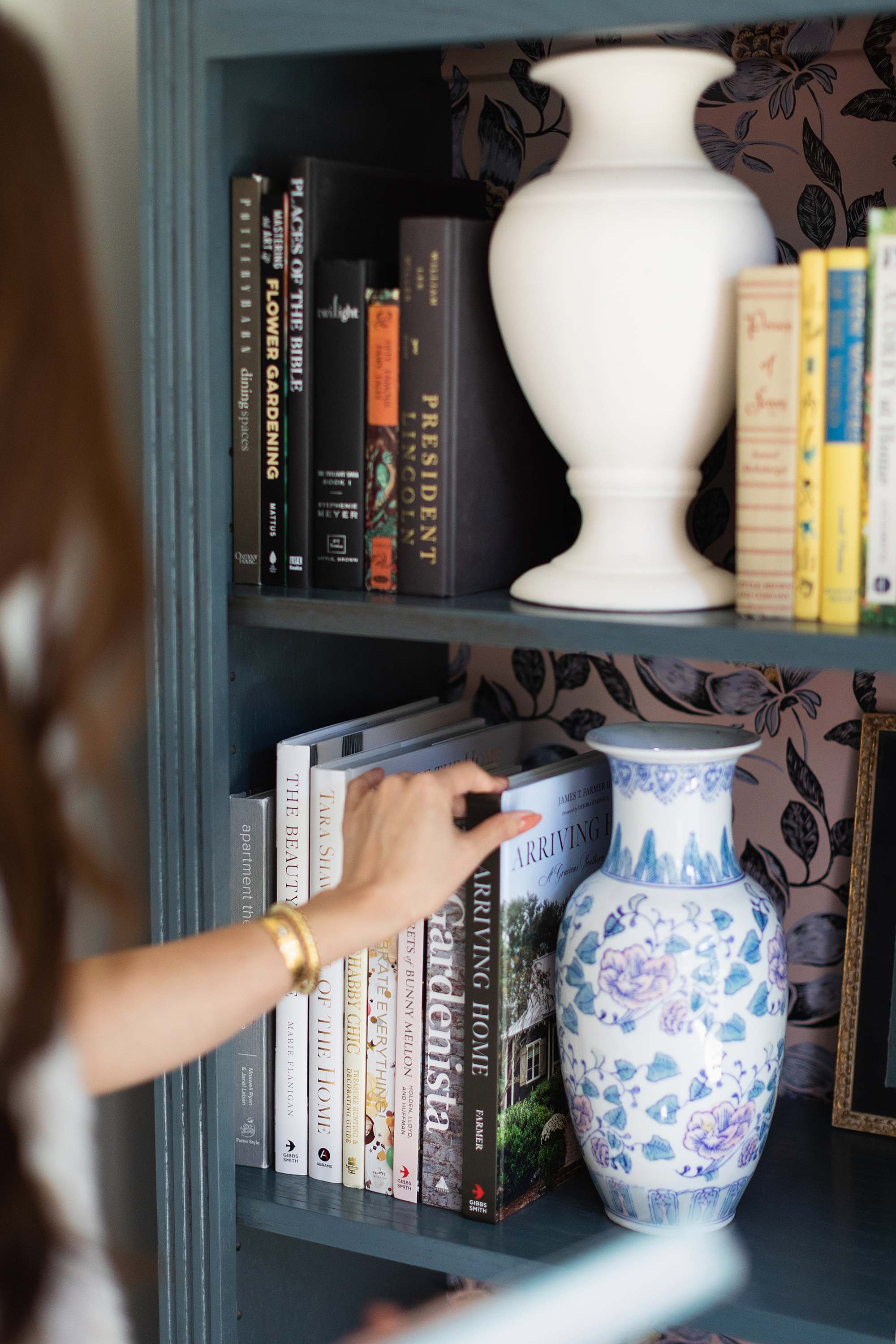
Here are the books that if blended together, fit my style. I keep these books within arms reach of my sofa – and often I browse them before I online shop. These might fit your style, or one specific style may pop out at you and be yours! Remember, the more ideas the better, you can always scale back!
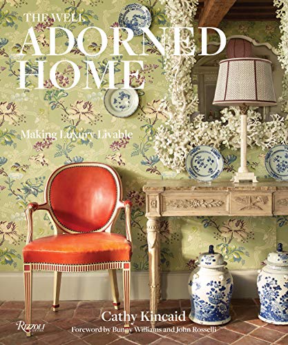
The Well Adorned Home: Making Luxury Livable
A mix of grandma-modern style with antiques and Southern – it’s a lot of wallpaper, blue and white porcelain and details everywhere. Some might find it overstimulating, but I find it inspiring with lots of personality, details, and antiques.
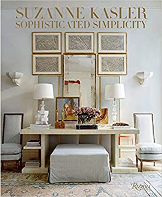
Suzanne Kasler: Sophisticated Simplicity
If you want your house to look expensive, this is the book that shows rooms that are elevated in style and sophisticated. Her style is American and European eclectic furnishings with a calming color palette. I like to revert back to this book to “reel it in” so I don’t go too all over the place. See when I met Suzanne at Ballard Designs.
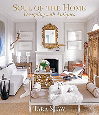
Soul of the Home: Designing with Antiques
Tara goes through the differences in antique style from Swedish, Italian to French (and all the Louis XIII and so on) differences. Quite remarkable to learn about the history and how to design with them.
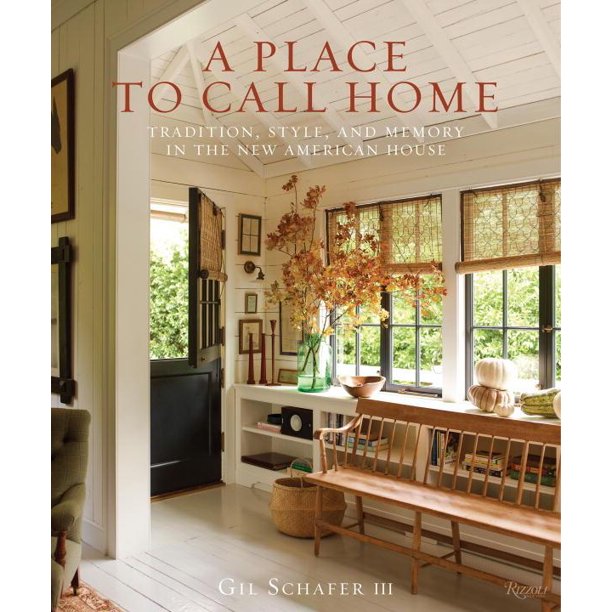
A Place to Call Home: Tradition, Style, and Memory in the New American House
If you are in the stages of building a home no matter what scale, take advice from an architect! Gil shares a beautiful portfolio of east coast homes and explains the importance of views, beautiful function (and how to hide some details), and the things that give a home character.
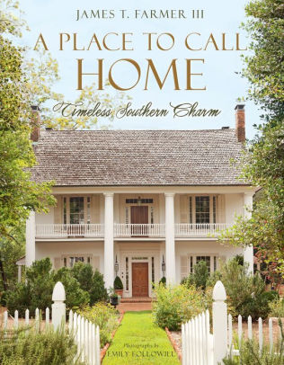
A Place to Call Home: Timeless Southern Charm
James T. Farmer has such great southern style and his home and garden have so much life in them! If you want to dive into southern style, this book is it! Wallpaper, chinoiserie, wicker, his rooms are decorated with a lot of items that show the owner’s heirlooms and Southern hospitality.
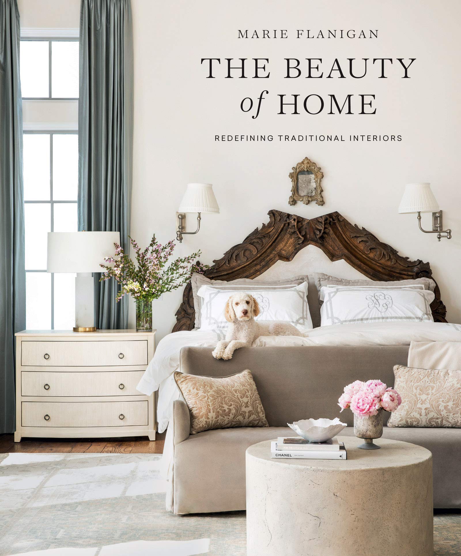
The Beauty of Home: Redefining Traditional Interiors
I consider Marie’s style modern traditional. Her style is sophisticated yet (to me, also minimal with patterns). I love it though, so I like to see these rooms and how sophisticated they are – it helps me realize I can have rooms not bursting in pattern sometimes and it can still look sophisticated.
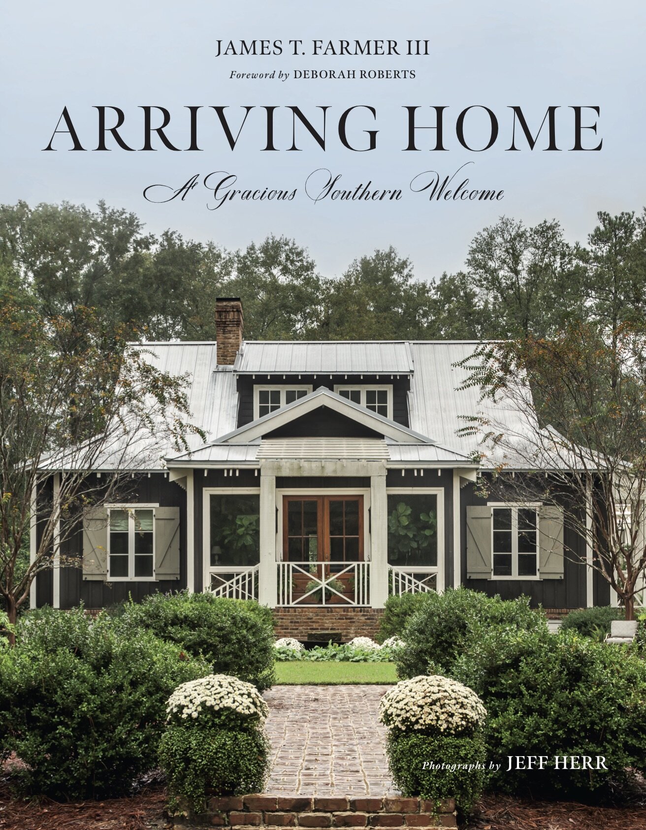
Arriving Home: A Gracious Southern Welcome
James T. Farmer’s latest book – this cover is his home, Farmdale! The book has more clients and their stories, I’m still currently working through this book – and will do so over and over again and have already come up with ideas on how I want to prune my front landscape!
I hope you feel inspired to start collecting interior design books and know they are great investments for your coffee table – you will be surprised a how much use you will get from them. We also have garden books, here’s a recent blog post I did on a few garden and flower books here.
I’ll work on a post about garden design books, and the design books that teach interior design, eventually. Give me some time to work on the list! If you have some favorites please let me know.
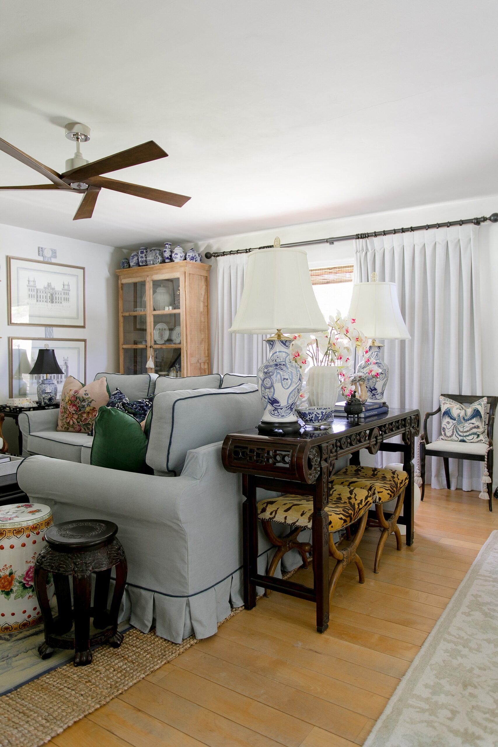
Diana Elizabeth has a lot of books, A LOT so much that she has several bookcases around her house – the console has a space for books, the other side of her office desk is a bookcase, one in the laundry room for her gardening books and two more flanking the Murphy bed. She never thought she’d own so many!


Adrian
Since I got my lovely kindle I do not read paper books a lot. But still I love to see on my shelf. Thank you for this post. It helps me to make my “book place” looks better.